
Building Film Recipes on Lumix Cameras
I’m not interested in creating technically perfect film simulations. Not only would that feel unconvincing to me, but I also believe it is the wrong approach to creating film-inspired recipes with real character and longevity.
What matters far more to me is understanding the emotional character of a given film stock and translating it into everyday digital photography: the atmosphere an image creates, and the way color and tonality shape the overall feeling of a photograph.
Every film stock has its own personality, and every recipe is an interpretation of that character and feeling.
Few film stocks illustrate this better than Fujifilm Superia X-TRA 400
Superia never felt polished or overtly cinematic. Instead, it always carried a casual, immediate quality and a distinctly human feel. The colors feel vibrant without becoming overly luxurious, the shadows can lean slightly cool or green, and the highlights soften gently rather than feeling clinically digital or artificially perfected.
More importantly, Superia images often feel like everyday memories before they feel like “photography.”
There is a slight roughness to them that makes them feel believable — a sense of spontaneity, reminiscent of disposable cameras and early 2000s family albums.
To recreate that feeling on Lumix cameras, I use a layered approach built around ten different image characteristics that together shape the final look. The process is intentionally focused less on dramatic stylistic effects and more on subtle tonal behavior and emotional coherence across different shooting conditions.
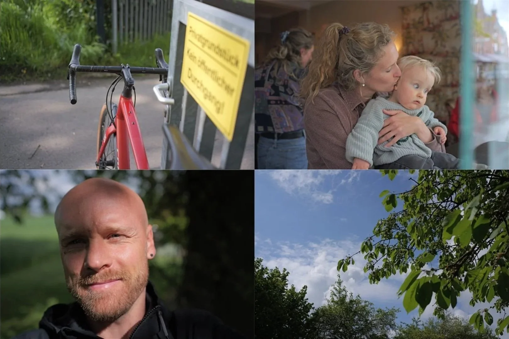
Straight-out-of-camera reference images using the “Natural” Photo Style on my S9
The first layer is exposure, because exposure largely determines the emotional baseline of an image. Slightly different brightness levels can completely change whether an image feels soft and organic or harsh and clinical.

Step 1 — Exposure adjustment
The second layer is basic contrast. Instead of creating overly punchy images, the goal here was to soften tonal transitions and reduce some of the hard digital precision that modern cameras often produce by default.

Step 2 — Basic contrast
The third layer focuses on midtone structure, which is one of the most important aspects of creating a believable film-inspired image. A surprising amount of photographic atmosphere lives in the midtones: skin, concrete, clouds, foliage, shadows and all the small textures that make an image feel natural and lived-in.

Step 3 — Midtone structure
The fourth layer is highlight rolloff. One of the fastest ways to break a filmic image is harsh digital clipping, so a large part of the recipe development process involved creating softer transitions into brightness that feel calmer and more photographic.

Step 4 — Highlight rolloff
The fifth layer introduces subtle split toning to create a gentle separation between warm and cool areas of the image. The effect is intentionally restrained, but it adds emotional depth without becoming stylized.
Step 5 — Split toning
The sixth layer focuses on color density rather than pure saturation. Film colors often feel dense and grounded instead of aggressively vibrant, so the goal was to give colors more presence while still keeping them believable.

Step 6 — Color density
The seventh layer shapes the relationship between saturation and luminance. Not all colors should behave equally, and sometimes slightly darker colors feel more “filmic” than simply increasing saturation across the board.

Step 7 — Saturation vs. luminance
The eighth layer involves small hue compressions and expansions, especially in greens, cyans and reds. These adjustments are subtle, but they help create a more coherent emotional palette without making the image feel artificial.
Step 8 — Hue compression / expansion
The ninth layer focuses specifically on skin tones. Skin is usually the first thing that makes a recipe feel unnatural if pushed too far, so this part of the process was intentionally handled with restraint.
Skin optimization is also one of the most important factors in determining how robust a film recipe remains across different lighting conditions. For this recipe, a wide range of skin tones was tested and refined under various lighting situations to ensure consistent and natural-looking results.

Step 9 — Skin optimization
The tenth step in a classic post-editing workflow would be grain. In the example shown here, additional grain was added afterward using the Lumix Lab app. During actual shooting, however, I simply use the in-camera grain setting set to “LOW”.

Step 10 — Added grain
One thing that became very clear throughout the development process is that film aesthetics are surprisingly tonal. A large part of what makes a film-inspired image feel convincing comes from tonal relationships, highlight behavior, softness, density and color balance.
Extreme hue shifts and overly stylized colors may look impressive at first, but they often fall apart in real-world photography — something that, in my experience, applies to many LUTs available online.
That is why grainyweekly recipes generally use color shifts carefully and with restraint. The goal is not to create loud filters that constantly draw attention to themselves, but images that feel emotionally coherent and visually believable across many different everyday situations.
What makes a good film recipe
A good film recipe should not constantly announce itself. It should quietly shape the emotional tone of an image.
The ideal reaction is probably not:
“Wow, crazy colors.”
It is something much more subtle:
“This image feels beautiful somehow.”
“Was this edited?”
“What camera is this?”
That quiet emotional response is ultimately far more interesting than obvious stylization.
— Toto